savrané
savrané
savrané
type
type
type
college assignment
college assignment
college assignment
year
year
year
2025
2025
2025
tools
tools
tools


the concept
the concept
the concept
the brand concept was born in a library, rooted in a deep respect for historical objects and the scent of heritage.
the brand concept was born in a library, rooted in a deep respect for historical objects and the scent of heritage.
the brand concept was born in a library, rooted in a deep respect for historical objects and the scent of heritage.
branding|packaging
branding|
packaging
brief
brief
brief
established in MMXXV, savrané positions itself within the luxury sector, focusing on legacy, intellect, and authority.
established in MMXXV, savrané positions itself within the luxury sector, focusing on legacy, intellect, and authority.
established in MMXXV, savrané positions itself within the luxury sector, focusing on legacy, intellect, and authority.
mood board/creative direction
mood board/creative direction
mood board/
creative direction


why the name savrané?
why the name savrané?
why the name savrané?
the name savrané is derived from the french root word "savre", which translates to refinement and preservation.
it signifies a deep respect for objects that endure rather than those that follow fleeting trends.
the name savrané is derived from the french root word "savre", which translates to refinement and preservation.
it signifies a deep respect for objects that endure rather than those that follow fleeting trends.
the name savrané is derived from the french root word "savre", which translates to refinement and preservation.
it signifies a deep respect for objects that endure rather than those that follow fleeting trends.
the logo
the logo
the logo
it features a high-contrast serif font that evokes the timeless refinement and authority of european heritage houses.
the logo uses the primary typeface, Didot LT Pro Bold Italic.
it features a high-contrast serif font that evokes the timeless refinement and authority of european heritage houses.
the logo uses the primary typeface, Didot LT Pro Bold Italic.
it features a high-contrast serif font that evokes the timeless refinement and authority of european heritage houses.
the logo uses the primary typeface, Didot LT Pro Bold Italic.


colour palette
colour palette
colour palette

packaging design
packaging design
packaging design


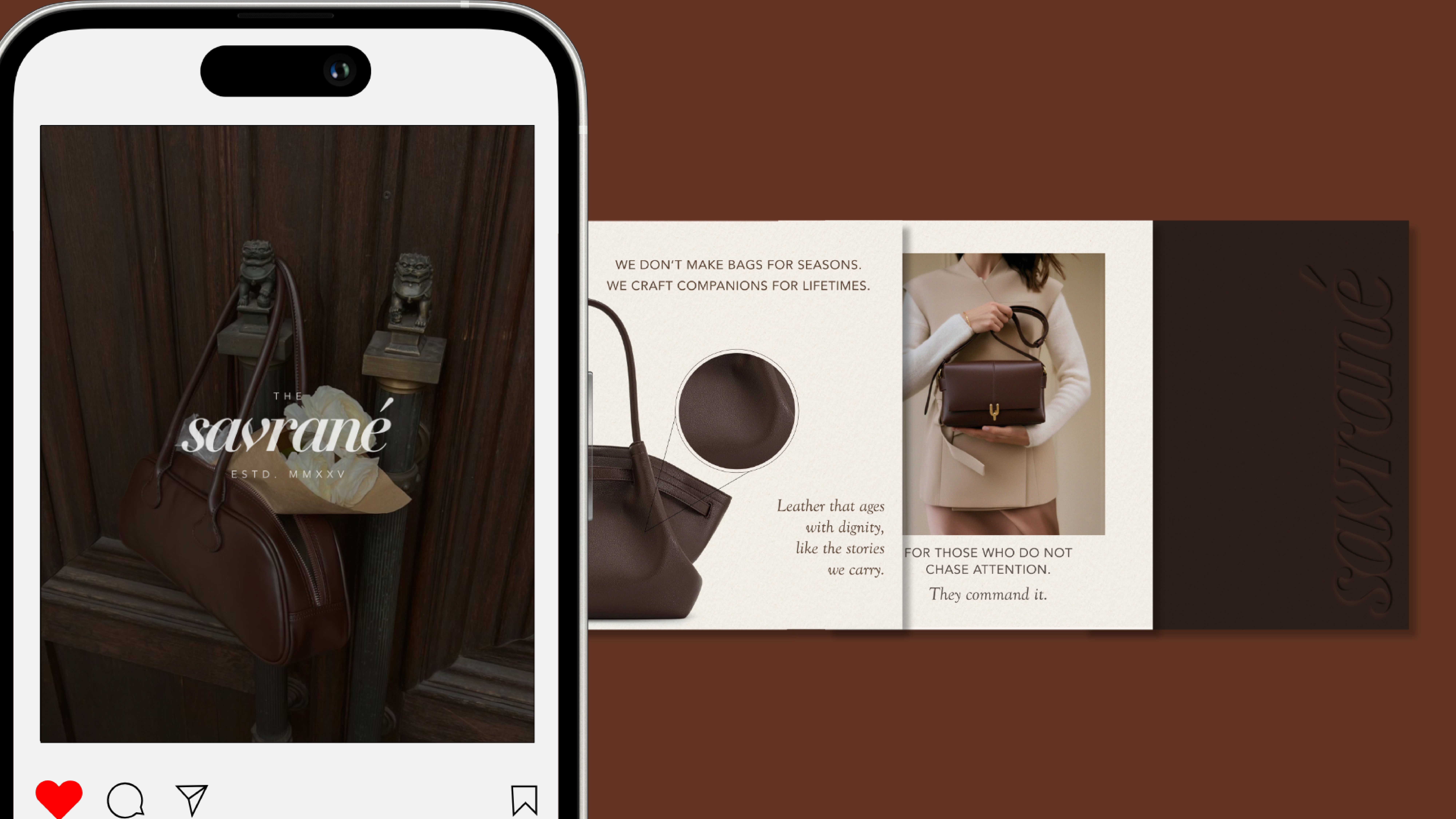
social media design
social media design
social media design